
A phrase we frequently hear following a demo of our digital marketing tools is, “We’d like to dip our toes in the water.” While this may be a good idea in some instances, say testing the water temperature before stepping into a hot shower, it doesn’t make sense when it comes to your website.
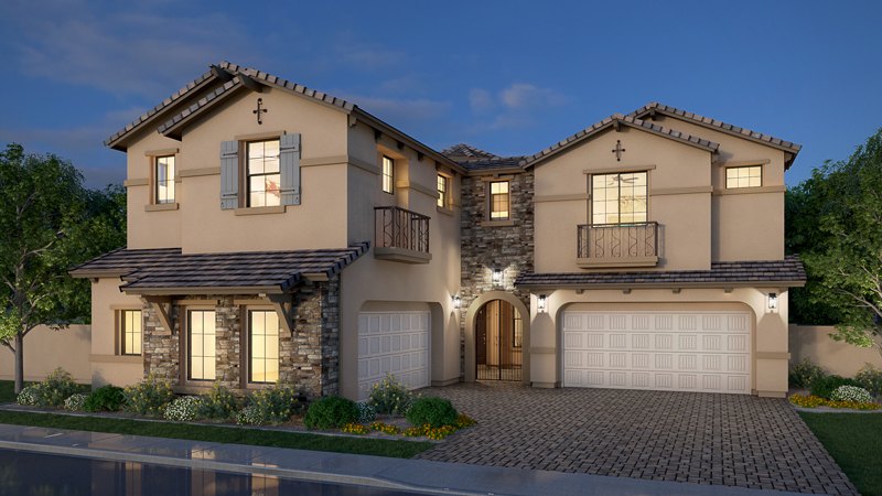
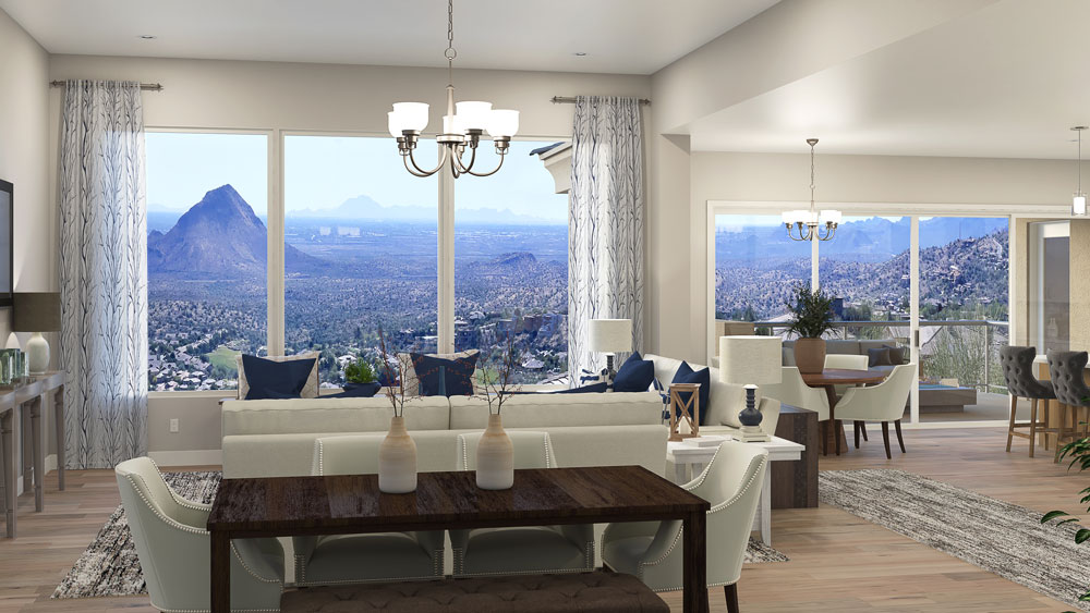
In today’s technology-driven world, your website is the front door to your business. So it is imperative to have one that is attractive, cohesive, easy to navigate, and COMPLETE. With many smaller builders competing in markets dominated by big public builders, professionalism is critical. So, if your website still mainly features black and white drawings and you are gradually replacing them with 3D renderings from random providers, and/or photos of built homes taken with a cell phone, you may want to reconsider that process. Black and white stick renderings captivate no one, and photos, unless professionally shot like ones by Chad Davies, rarely do your homes justice, especially when new landscaping consists of a few small shrubs and twigs for trees. Buyers are looking for their dream home, not one that screams, “weekend projects ahead!”
Think Like the Big Builders
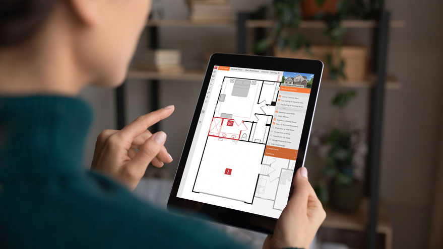
To see what homebuyers expect when they visit your website, it pays to look at what the bigger builders are doing. A few of the top sites like Toll Brothers and Taylor Morrison include an abundance of professionally shot photographs and videos to create visual interest, meanwhile the individual model pages feature 3D photoreal renderings for consistency. Their sites also include interactive floor plans allowing potential homebuyers to select structural options and oftentimes space plan with a furniture planner.
The Small Builder Advantage
Where you can stand out from the big guys is by personalizing and streamlining. Even the most thoughtful big builder sites are rather convoluted due to an excess of homes and communities. With fewer homes to showcase, smaller builders have a distinct advantage. Professional renderings and virtual tours need not break the bank, and they allow homebuyers to explore your homes from anywhere in the world.
Smaller inventory encourages deeper exploration of your models, especially when they feature engaging virtual tours, visualizers, and interactive floor plans. And studies show the more time spent customizing a home with digital tools, the more likely the prospect is to purchase that home.
The Best Time to Upgrade a Website is…
NOW is the perfect time to add digital assets or make other upgrades to your website. Yes, the market is down and budgets are stretched, but we know housing will come roaring back at some point – it always does – and builders need to be prepared. Website upgrades also have a small price tag compared to other marketing ventures like building a model home, or even TV ads. So, take some time during this downturn to be thoughtful, strategic, and intentional about website upgrades that will attract homebuyers and generate solid leads as the housing market begins to turn.
Laying Out The Welcome Mat
In summary, as your website is your online front door, be sure to lay out the welcome mat. Draw in prospects with a clean, easy to navigate site, with stimulating imagery and engaging interactive tools. Remember, consistency is critical. Get all renderings from the same provider. Ditto for interactive floor plans. Better yet, use the same vendor for all digital marketing assets for peace of mind and the best results. Hence the reason Outhouse offers CAD services . For all-in clients, assets are automatically updated across all digital product lines when a change is made in the CAD files. This not only ensures accuracy and consistency, but also reduces costs. And, finally, check out big builder sites for inspiration, but be sure to keep an open mind on ways to make your site easier to navigate and more compelling.